1. The Network Backbone: Dominance of High-Frequency Bus Routes
Analysis of route frequency reveals the hierarchical structure of Brisbane's bus network and service concentration patterns.
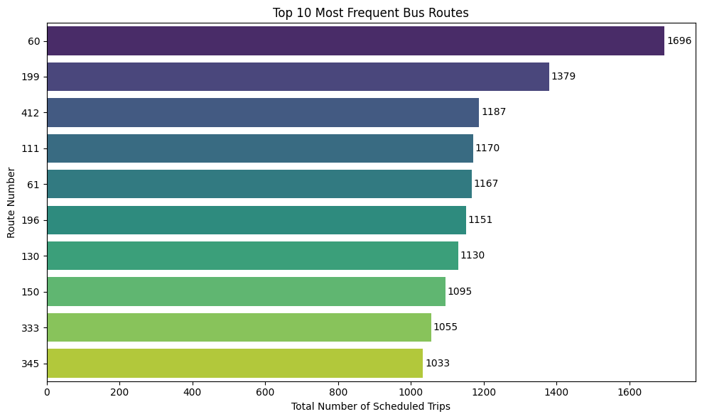
Network Backbone Analysis
Finding
The bus network is not uniform; it operates on a "hub and spoke" model where a few key routes act as high-frequency arteries. Route 60 (CityGlider) is the most frequent in the entire network, with 1,696 scheduled trips. It is followed by Route 199 (1,379 trips) and Route 412 (1,187 trips). The data shows a steep drop-off in frequency after the top 10 routes, confirming that a small subset of routes handles a disproportionately large share of service.
Strategic Takeaway for Translink
These top-tier routes are the lifeblood of the network. Their reliability and frequency are critical to public perception and overall system performance.
Infrastructure Priority
Prioritize for dedicated bus lanes and signal priority upgrades
Expansion Blueprint
Use success model for future high-frequency corridors in underserved areas