Back to All Projects

Host Compass: Airbnb Market Intelligence

In-depth analysis transforming raw Airbnb data into actionable intelligence for hosts and stakeholders. Data-driven strategies for maximizing revenue, occupancy, and market position.

Python PostgreSQL Market Analysis Matplotlib Geospatial

Technology Stack

Python 3 Pandas NumPy PostgreSQL SQL Matplotlib Seaborn Plotly Folium Jupyter Git/GitHub

Methodology

Data Source

Analysis conducted using comprehensive Airbnb datasets from Inside Airbnb, a mission-driven project providing quarterly data for residential community impact analysis. Dataset includes detailed listings, calendar, reviews, and geospatial neighborhood data under Creative Commons Attribution 4.0 International License.

  1. Data Collection: Utilized Inside Airbnb quarterly datasets with complete listing information including host details, pricing, availability, and location data.
  2. ETL Pipeline: Cleaned and processed raw data to handle missing values, outliers, and standardize categorical variables for analysis.
  3. Geographic Analysis: Mapped listing distribution across neighborhoods using GeoJSON boundary files to identify concentration patterns.
  4. Host Performance Analysis: Analyzed host portfolio sizes, activity levels, and revenue generation patterns to understand market dynamics.
  5. Price Analysis: Examined pricing distributions, identified outliers, and analyzed price variations across different market segments.

Interactive Market Dashboard

Dashboard visualization showing key market metrics and geographic distribution.

Interactive Dashboard

Coming Soon

Interactive market dashboard in development

Business Intelligence Findings

Comprehensive analysis answering 11 key business questions to provide data-driven strategies for hosts and Airbnb stakeholders.

1. Revenue Hotspots and Marketing Strategy

Analysis of revenue and occupancy metrics to pinpoint the most financially successful market segments.

Revenue & Occupancy Insights
Figure 1: Revenue & Occupancy Insights

Detailed Analysis Breakdown

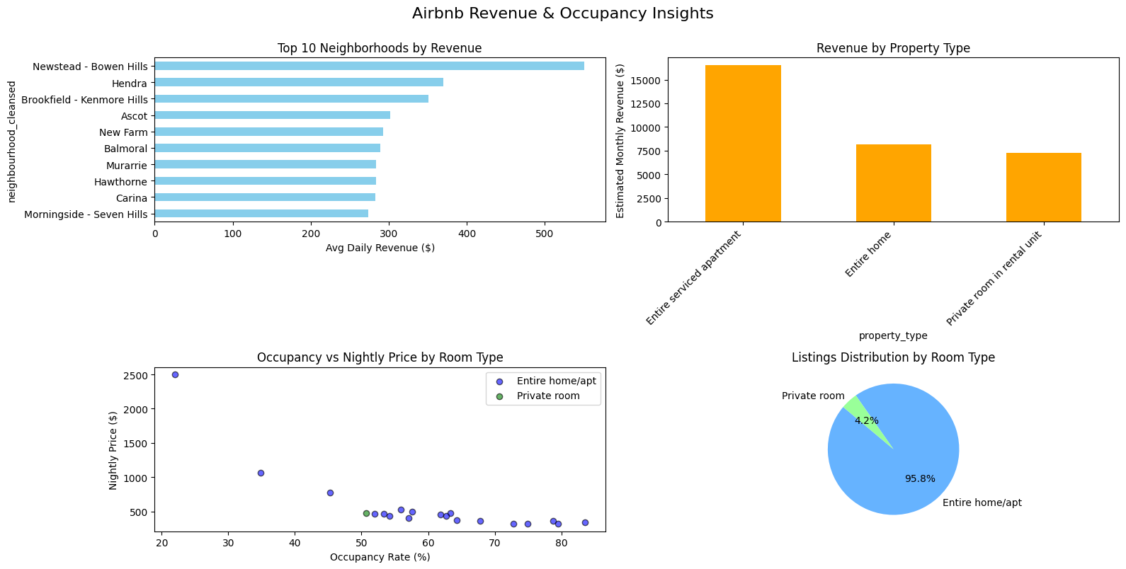
Top Earning Neighborhoods (Horizontal Bar Chart)

The analysis reveals a significant disparity in earnings across neighborhoods. Newstead - Bowen Hills stands out as the highest-earning area, generating an average daily revenue of over $500 per listing. This is substantially higher than other leading neighborhoods like Hendra and Brookfield - Kenmore Hills, which fall between $350 and $400.

Most Profitable Property Types (Bar Chart)

Entire serviced apartments are in a class of their own, with an estimated monthly revenue exceeding $16,000. This is more than double the revenue of the next most profitable category, "Entire home," which earns approximately $8,000 per month.

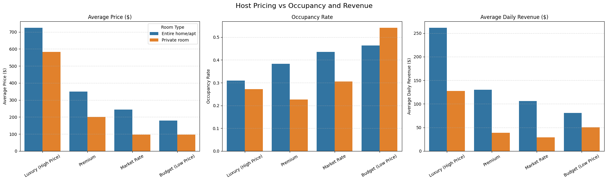
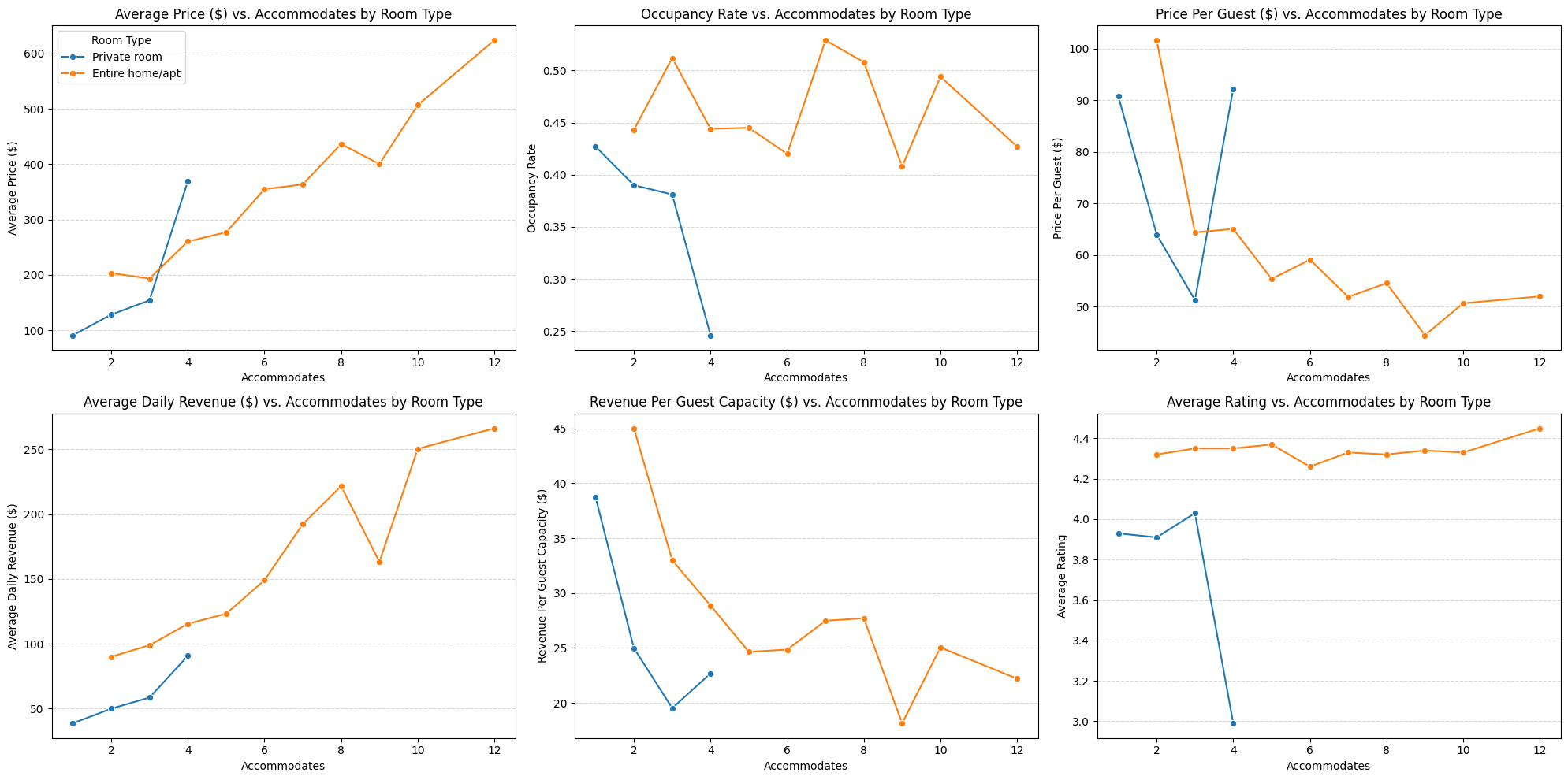
Occupancy vs. Price (Scatter Plot)

The scatter plot clearly shows that Entire home/apt listings (blue dots) have a wide distribution, commanding prices from a few hundred to over $2,500, with occupancy rates ranging from 20% to over 80%. In contrast, Private rooms (green dots) are clustered at a much lower price point (under $500) and have a narrower occupancy band, suggesting a price ceiling for this category.

In-Depth: Market Dominance (Pie Chart)

Entire Home/Apt
95.8%
market dominance
Private Rooms
4.2%
niche offering
Market Position
Monopoly
structure

The pie chart illustrates a near-monopoly in the market's structure. Entire home/apt listings constitute a staggering 95.8% of the available properties in this analysis. This isn't just a majority; it signifies that for this city, the "Entire home/apt" is the quintessential Airbnb product. "Private room" listings make up a mere 4.2%, positioning them as a niche offering rather than a primary competitor. This dominance dictates guest expectations and the fundamental business model for hosts in this market.

Strategic Takeaway for Airbnb

Based on this data, I recommend Airbnb's corporate strategy should be two-fold:

1. Amplify the Core Product

Since Entire homes/apartments define the market, Airbnb should double down. This means creating marketing campaigns specifically showcasing these property types, developing host-education resources focused on optimizing entire homes, and featuring them more prominently in search results.

2. Targeted Growth

The data provides a clear map for resource allocation. Host acquisition teams should be deployed to Newstead - Bowen Hills and other top-performing neighborhoods. Furthermore, the exceptional revenue from "serviced apartments" indicates a lucrative sub-market that Airbnb could formally recognize with a dedicated search filter or a partnership program with property management companies.

2. Seasonal Demand and Dynamic Pricing

Booking data analysis across the calendar year reveals clear seasonal trends and pricing opportunities.

Yearly Booking Demand Analysis
Figure 2: Yearly Booking Demand Analysis

Detailed Seasonal Analysis

Peak Season (Line & Bar Charts)

The data shows an undeniable peak in demand during the winter month of July. The bar chart reveals that total bookings in July surged to 96,422, the highest of any month. The line chart confirms this, with the booking rate for the dominant "Entire home/apt" category cresting at its highest point of the year.

Low Season (Line & Bar Charts)

Demand plummets in the spring, with September marking the yearly low. Total bookings dropped to just 44,122—less than half of the July peak.

Demand Volatility (Heatmap)

The heatmap provides a stark visual of this seasonality. The deep red color in the July row for "Entire home/apt" (booking rate of 57.8%) contrasts sharply with the pale yellow of other months, particularly for "Hotel room" and "Shared room," which show extremely low booking rates (e.g., 1.1% for hotel rooms in May) for much of the year.

Peak Season
July
96,422 bookings
Low Season
September
44,122 bookings
Volatility
54%
demand swing

Strategic Takeaway

The seasonality is too significant to ignore. Hosts must adopt a dynamic pricing model. I recommend:

Peak Period Strategy

Increasing nightly rates by 25-40% for the June-August period

Low Season Recovery

Implementing promotional discounts or reducing minimum night stays to stimulate demand during the September-October trough

3. Hallmarks of a High-Performing Host

Host segmentation analysis identifying performance attributes that separate elite hosts from the rest.

Host Performance Analysis
Figure 3: Host Performance Analysis

Host Performance Segmentation

Host Distribution (Pie Chart)

The largest segment of hosts falls into the "Needs Improvement" category, at 35.7%. In contrast, "Elite Hosts" make up only 28.4% of the population, indicating that top-tier performance is the exception, not the rule.

The Instant Book Advantage (Bar Chart)

The "Avg Instant Book Rate" bar chart reveals a critical insight. "Elite Hosts" have an average Instant Book adoption rate of over 25%. This is double the rate of hosts in the "Needs Improvement" tier, who hover around 12-13%. This suggests a strong correlation between reducing booking friction and achieving top-tier status.

Performance, Not Price (Bar Chart)

The "Key Metrics" chart shows that average price is not a key differentiator between tiers. "Elite Hosts" and "Needs Improvement" hosts have very similar average prices. The real difference lies in occupancy rate, where top hosts perform significantly better.

Elite Hosts
28.4%
of host population
Needs Improvement
35.7%
largest segment
Instant Book Rate
25%+
elite host advantage

Strategic Takeaway

The single most impactful, controllable factor for hosts looking to improve is to enable Instant Book. Furthermore, success on Airbnb is a function of operational excellence (driving high ratings and occupancy) rather than simply setting a high price.

Key Action Item

Enable Instant Book feature to double your booking conversion rate

Focus Area

Operational excellence over pricing strategy for sustainable growth

4. The Critical Role of Reviews

Impact analysis of review scores and volume on booking performance and revenue generation.

Ratings, Review Volume, and Revenue Insights
Figure 4: Ratings, Review Volume, and Revenue Insights

Review Impact Analysis

Revenue and Ratings (Bar Chart)

The "Avg Daily Revenue" chart shows a clear trend: higher ratings and more reviews lead to more money. The most profitable listings are those with an "Excellent" rating and a healthy review volume (16-60+ reviews), consistently earning $120-$140 per day.

The Cost of Silence (Bar & Heatmap)

Having "No Reviews" is a major financial handicap. These listings have the lowest booking rates and a median price of only $227, far below the $200+ commanded by highly-rated listings.

Booking Rate Impact (Bar Chart)

The "Booking Rate (%)" chart shows that guests are far more likely to book a property with a proven track record. "Excellent" listings with 60+ reviews achieve booking rates over 50%, while listings with "Fair" or "Poor" ratings struggle to reach 35%.

Excellent + Reviews
$120-140
daily revenue
No Reviews
$227
median price penalty
Excellent Booking Rate
50%+
with 60+ reviews
Poor Rating Impact
35%
booking ceiling

Strategic Takeaway

For New Hosts

Getting the first 5-10 positive reviews is the most important initial goal. This establishes credibility and breaks through the "no reviews" penalty.

For Established Hosts

Maintaining a rating above 4.7 ("Very Good") is the minimum threshold for competitive performance in the market.

5. Competitive Pricing Strategies

Analysis of how listing price relative to competitors affects booking success and revenue optimization.

Host Pricing vs Occupancy and Revenue
Figure 5: Host Pricing vs Occupancy and Revenue

Pricing Strategy Analysis

The Revenue Paradox (Bar Charts)

The three bar charts, when read together, tell a compelling story. While "Luxury (High Price)" listings have the highest average price (over $700), their low occupancy (around 30%) means their average daily revenue (approx. $260) is lower than that of "Premium" listings (approx. $270).

Occupancy vs. Price

There is a clear, inverse relationship shown. As the pricing tier moves from "Budget" to "Luxury," the "Occupancy Rate" bar consistently drops, while the "Average Price" bar consistently rises.

The Balanced Winner

The "Premium" and "Market Rate" tiers appear to be the sweet spot, balancing a strong nightly rate with a healthy occupancy rate to generate the highest average daily revenue.

Luxury Price
$700+
high nightly rate
Luxury Occupancy
30%
low utilization
Premium Revenue
$270
optimal daily income
Luxury Revenue
$260
lower than premium

Strategic Takeaway

Hosts should not aim to be the most expensive listing on the market. The data shows the most effective strategy is to price a property competitively at or slightly above the market average for its category to maximize overall revenue.

Recommended Strategy

Target Premium or Market Rate pricing tiers for optimal revenue balance

Avoid

Luxury pricing strategy leads to revenue paradox despite higher nightly rates

6. The Impact of Minimum Night Requirements

Assessment of how minimum-night policies influence occupancy rates, revenue generation, and booking dynamics.

Impact of Minimum Night Policies on Occupancy and Revenue
Figure 6: Impact of Minimum Night Policies

Minimum Night Policy Analysis

Daily Revenue by Policy (Bar Chart)

The "Daily Revenue" bar chart clearly shows that the most profitable policies are "4-7 Nights" and "8-14 Nights", which both generate over $120 per day. The very common "1 Night" policy is one of the least profitable.

Occupancy vs. Nights (Line Chart)

The line plot reveals that longer minimum stays do not guarantee higher occupancy. For "Entire home/apt" listings, occupancy peaks for short-to-medium stays and then declines for very long minimum night requirements.

Market Behavior (Bar Chart)

The "Distribution" chart shows that the market is saturated with listings offering "1 Night" minimums (over 2,000 listings). This high supply likely drives down the profitability of this strategy.

4-7 Nights
$120+
daily revenue
8-14 Nights
$120+
daily revenue
1 Night Market
2,000+
oversaturated
Optimal Range
2-7
nights strategy

Strategic Takeaway

The optimal strategy appears to be a minimum stay of 2 to 7 nights. This avoids the hyper-competitive 1-night market while still capturing the most lucrative segment of travelers, maximizing daily revenue.

Sweet Spot Strategy

Target 4-7 night minimum to maximize revenue while maintaining healthy occupancy

Market Differentiation

Avoid oversaturated 1-night market with 2,000+ competing listings

7. Market Saturation and Opportunity

Neighborhood classification analysis identifying areas of high competition versus high growth potential.

Average Revenue per Listing Day by Market Classification
Figure 7: Market Classification Revenue Analysis

Market Classification Analysis

The High-Demand Engine (Bar Chart)

The bar chart shows that "High Demand" markets are the most financially rewarding, generating an average of $110.08 per listing per day.

Surprising Saturation

Counter-intuitively, "Oversaturated" markets are the second most profitable at $104.47 per day. This indicates that while competition is fierce, the sheer volume of demand sustains high revenue potential.

The Opportunity Zone

For new hosts, "Emerging Market" ($94.97/day) and "Growth Opportunity" ($93.24/day) represent the most attractive entry points. They offer strong revenue potential with significantly less competition.

High Demand
$110.08
highest revenue
Oversaturated
$104.47
surprising strength
Emerging
$94.97
entry opportunity
Growth Opportunity
$93.24
low competition

Strategic Takeaway

A new host's market entry strategy should be to first target a "Growth Opportunity" or "Emerging" market. Once established with strong reviews, they can then consider expanding into the more competitive but lucrative "High Demand" markets.

Entry Strategy

Start in Growth Opportunity or Emerging markets to build reputation with less competition

Expansion Path

Graduate to High Demand markets once established with strong review profile

8. Optimal Property Size and Capacity

Analysis of how guest capacity impacts pricing strategies, occupancy rates, and revenue optimization.

Property Size vs. Performance
Figure 8: Property Size vs. Performance

Property Capacity Analysis

Revenue by Size (Line Charts)

The "Average Daily Revenue" line chart shows a clear upward trend for "Entire home/apt" listings as capacity increases, peaking for properties that accommodate 8 guests (at nearly $250/day).

Price Per Guest Efficiency (Line Charts)

The "Price Per Guest" chart shows that smaller, 2-person listings are the most efficient, charging over $100 per guest. This efficiency drops as the property size increases.

Occupancy Stability (Line Charts)

The "Occupancy Rate" chart demonstrates that smaller properties (1-4 guests) have more stable and generally higher occupancy rates than larger properties.

Maximum Revenue Strategy
8 Guests
$250/day peak revenue
Higher revenue, lower occupancy risk
Efficiency Sweet Spot
2-4 Guests
$100+ per guest rate
Stable high occupancy rates

Strategic Takeaway

Hosts face a choice: maximize total revenue with a larger property (6-8 guests) that may have lower occupancy, or opt for a smaller, more efficient property (2-4 guests) that is easier to keep booked year-round.

High Revenue Path

Target 6-8 guest capacity for maximum daily revenue potential

Stable Income Path

Choose 2-4 guest properties for consistent high occupancy and efficiency

9. Weekday vs. Weekend Booking Patterns

Comparative performance analysis between weekdays and weekends revealing pricing opportunities.

Weekday vs Weekend Performance
Figure 9: Weekday vs Weekend Performance

Weekend vs Weekday Performance

The Weekend Premium (Bar Charts)

The "Average Price" chart quantifies the weekend price jump. For "Entire home/apt," the price increases from about $275 on weekdays to over $325 on weekends. This trend holds for all room types.

Revenue Impact

This combination of higher prices and higher booking rates on weekends leads to a massive jump in "Average Daily Revenue." For "Entire home/apt," it goes from approx. $120/day on weekdays to over $125/day on weekends.

Universal Trend

Every room type, without exception, sees an increase in booking rate, average price, and average daily revenue on weekends.

Weekday Price
$275
entire homes baseline
Weekend Premium
$325+
18% price increase
Revenue Boost
$125+
weekend daily revenue

Strategic Takeaway

A weekend pricing strategy is not optional; it is essential. Every host should be increasing their nightly rates for Friday and Saturday. Failure to do so is leaving significant money on the table.

Implementation Required

Implement 18% weekend price increase for Friday-Saturday to capture universal demand surge across all property types

10. Booking Lead Time and Calendar Management

Analysis of booking timing patterns to optimize calendar strategy and dynamic pricing.

Booking Lead Time Analysis
Figure 10: Booking Lead Time Analysis

Lead Time Analysis

The Last-Minute Rush (Bar Chart)

The "Booking Rate" chart shows that the highest probability of a day being booked is within the "0-7 days" window. This indicates a very strong market for last-minute travel.

Pricing for Planners (Bar Chart)

Conversely, the "Average Price" chart shows that the highest prices are paid by those who book far in advance ("180+ days").

Key Booking Window

The highest booking rates are concentrated in the near term (0-30 days), while prices are highest in the long term (90+ days).

Last-minute (0-7 days)
Highest
booking rate
Long-term (180+ days)
Highest
prices paid
Sweet Spot
90+ days
price optimization

Strategic Takeaway

An active, dynamic pricing strategy based on lead time is critical. I recommend setting high initial prices for dates 6+ months out. As dates get closer (within 90 days), prices should be gradually adjusted based on demand. Within the 14-day window, hosts can offer last-minute discounts to fill any remaining gaps and maximize occupancy.

Long-term (6+ months)

Set high initial prices

Medium-term (90 days)

Gradual adjustments based on demand

Last-minute (14 days)

Offer discounts to fill gaps

11. Geospatial Distribution of Listings

Interactive Folium map visualization revealing geographic clustering patterns and location-based pricing dynamics across the city.

Interactive geospatial distribution map (Folium)

Limitations

Future Work

Explore the Code

Data scraping scripts, analysis notebooks, and predictive models available in the repository.

View on GitHub
Back to Projects